
How Soul & Surf’s graphic design played its part in us finding our niche within the surf, yoga and retreats world.
Words by Ed Templeton | 13th June '24
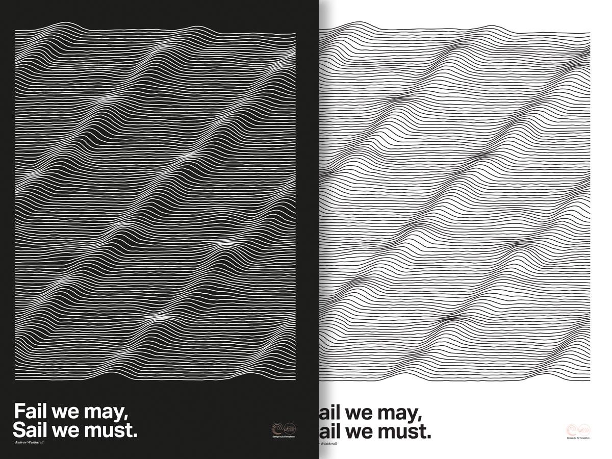
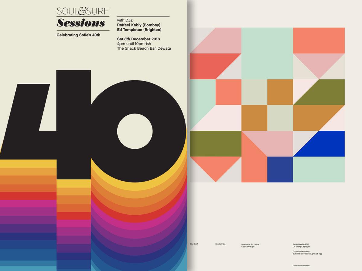
Fail we may, Sail we must ~ Andrew Weatherall | Design by Ed Templeton & Rahsaan Kably
In the distant past I was a graphic designer. My company Red Design in the UK created record covers, branding, animated films, art direction and all manner of other creative consultancy projects. Being a designer was a dream of mine from about the age of 13 when I realised that designing record covers was actually ‘a thing’.
Me & my mate Hamish set up our design company pretty much straight from university and pursued ‘the dream’. Yet 12 years in (Hamish left after 7), I’d begun to have enough of relentless deadline chasing and the soul-destroying sycophancy of appeasing witless, arrogant, often inexperienced marketing managers to get a job over the line.
It still took a few years to finally cross the line, but in my mid to late 30’s I gave my company to the studio manager and went surfing instead.
Sofie & I stumbled into founding Soul & Surf and lo and behold I still got to flex my design-urge but with only us as client… Winning.
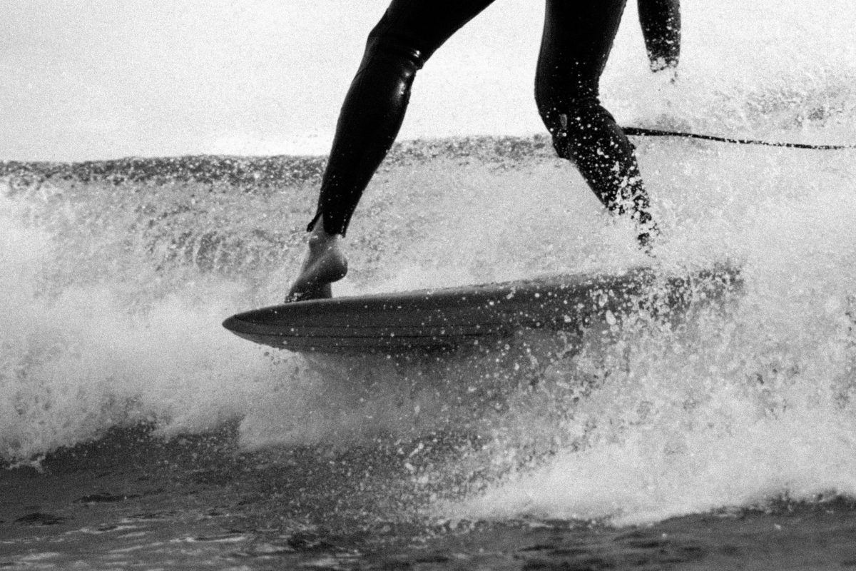
My initial brief was to try to avoid our greatest fear. Of being lumbered with hosting gaggles of macho surf-dudes flexing muscles, watching hectic surf films and generally being gnarly. At the time most surf graphics were that sort of ‘extreme’ faux zine style, handwritten titles, fake photocopy, bright, bold with rad photos.
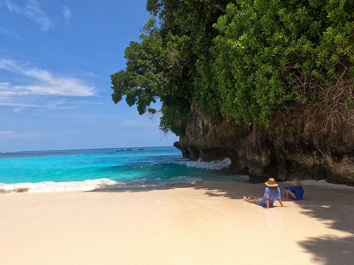
We did dusty pink, dreamy landscape photos, small waves and simple, clear swiss-influenced typography. Like no other surf businesses we knew of. It worked, we attracted the opposite end of the surfing spectrum and a bunch of like-minded souls who we got on with like a house on fire.
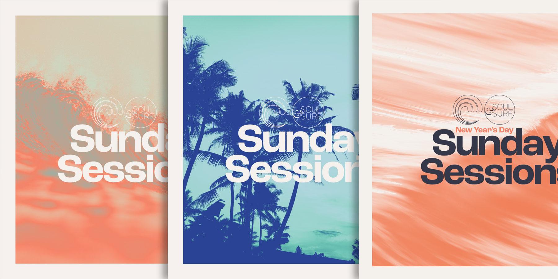
Sunday Sessions | Design by Rahsaan Kably
Our design baseline stems from and continues to be influenced by mid-century modernist designers. A timeless, anti-fad, grid system design philosophy pioneered by designers like Max Bill, Wim Crouel & Josef Müller-Brockmann who were working 40 to 50 years ago. Whereby messages are conveyed directly, succinctly and with integrity. Not fancy, not flashy, not trying too hard.
We knew we were not a stereotypical surf ‘camp’, we are not great surfers, we are not rad, or gnarly, we don’t play Bob Marley on loop. We are not extreme, we are not overtly male. Yet neither are we serious, high-brow, overtly feminine muesli-knitting yogis. So it made sense to consciously avoid the surf or yoga style-fads, fashions and cliches and plough our own furrow.
One of my early design heroes David Carson art directed Surfer magazine from the late 80’s and infuriated most of the surf world with his experimental style. In fact, thinking about it, the style he set back then eventually became the surf vernacular for the next 20+ years, it disrupted the status quo and then, inevitably, half-arsed pastiches of his style became the status quo.
...hidden in a tiny backwater of the surf world - but I like to think we also challenged the accepted norms for the sector at the time.
Some of our posters and t-shirts are simply pastiches of classic modernist posters but applied in a sector you don’t expect to see this kind of thing, some are simply inspired by and informed by the foundations of modernist design with our own twist.
A twist that twisted a little more when a young Rahsaan Kably started designing for Soul & Surf. Rahsaan started out volunteering a season in Kerala until we discovered he was primarily a designer - a designer who shared some references and inspiration with Ed. In the early years Rahsaan assisted Ed, applying existing design-styles across various formats, until naturally Rahsaan was encouraged to add his own unique take on the in-house style and a truly collaborative style developed.
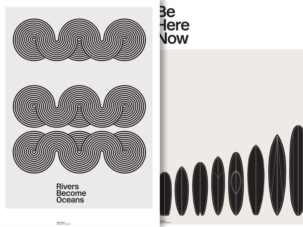
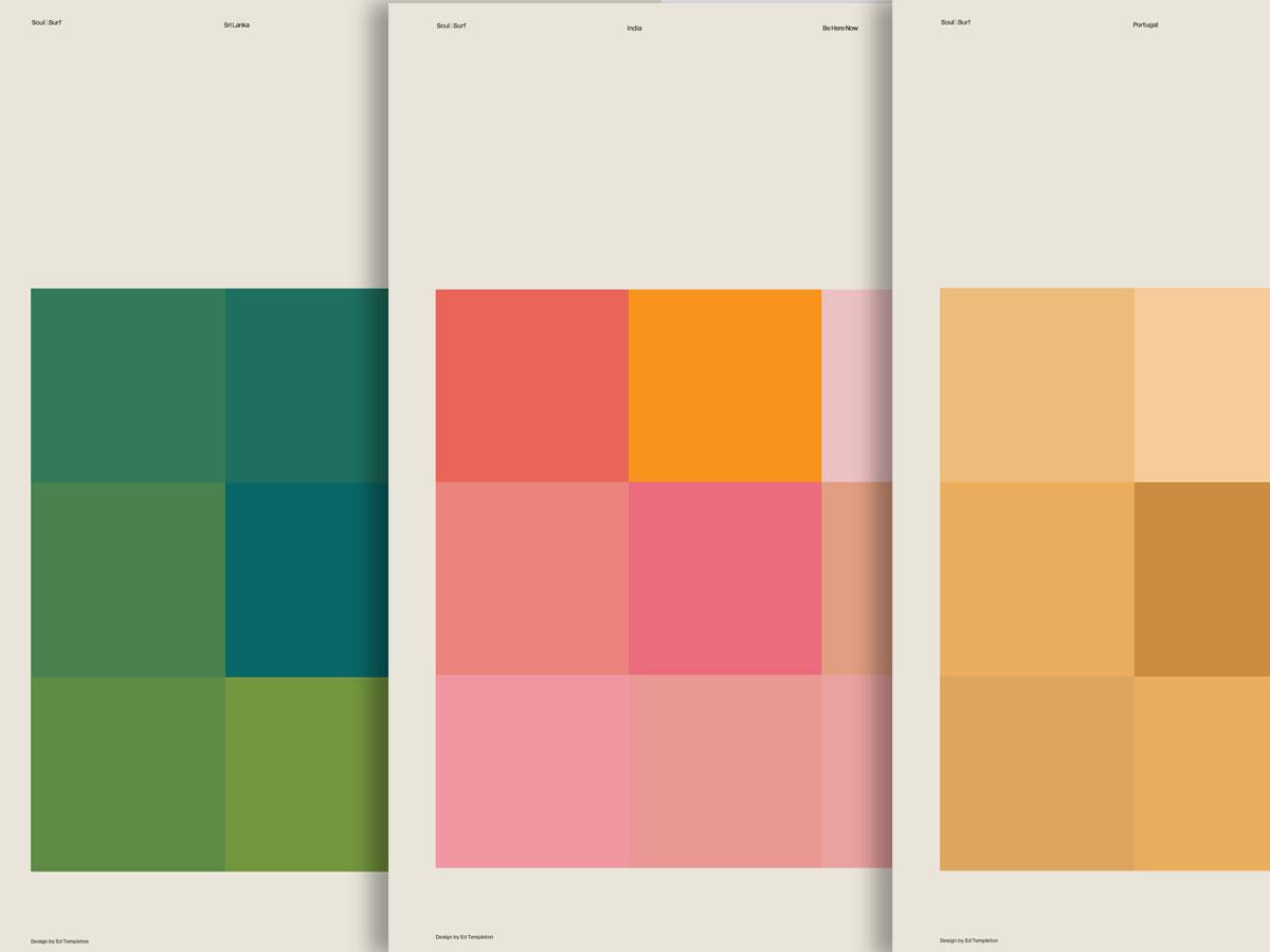
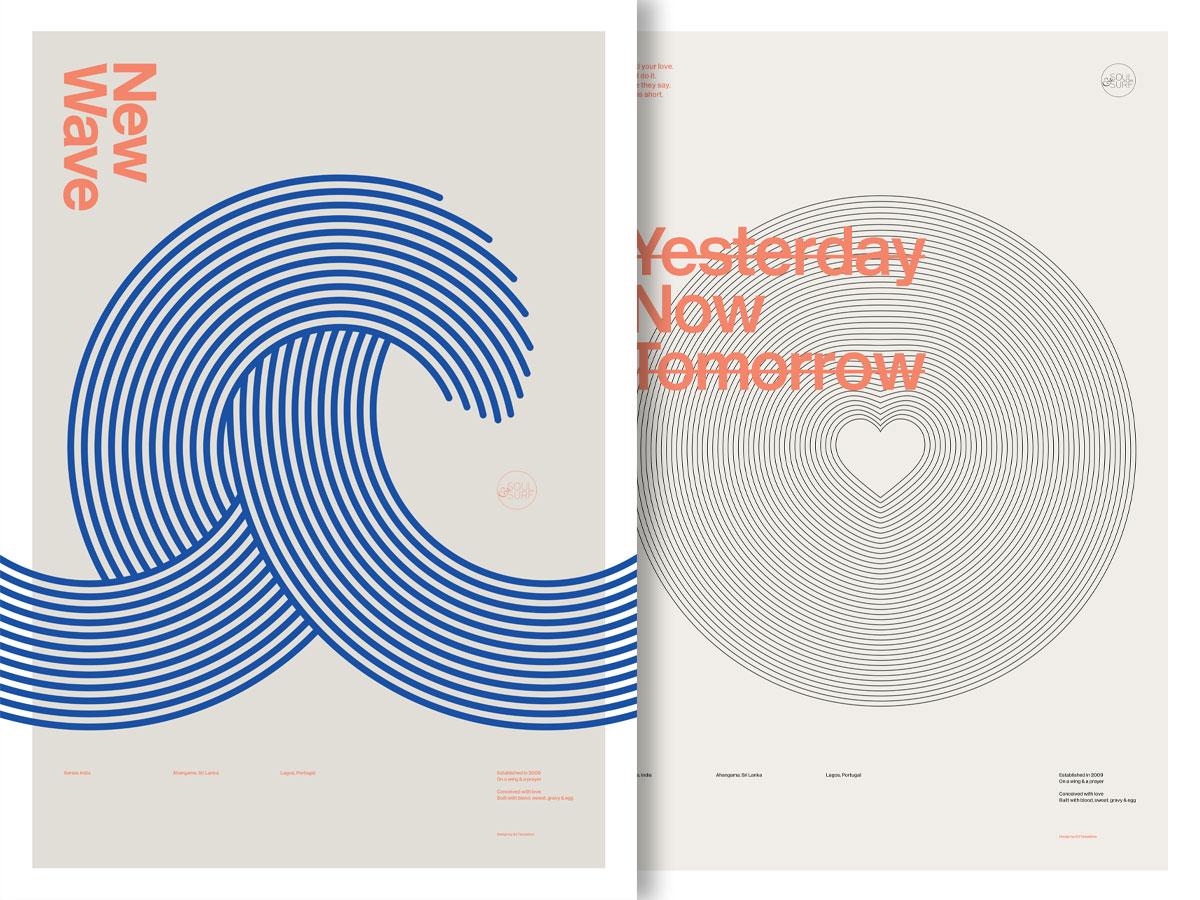
Designs by Ed Templeton & Rahsaan Kably
Fundamentally this look & feel dovetails with our overall ethos of being true to the art, design, writing and music we love and not pandering to the commercially accepted norms for the surf or yoga worlds just so we can sell more stuff.
In everything we do we don’t try and second-guess what would be most popular. We dig deep and find and do the things that are most inspirational & exciting to us and trust that it will chime with others.
I guess we therefore turn off a whole demographic-heap because of our design, our writing, our website, our music and that just has to be OK. From day one we decided to not try to be all things to all people (and end up saying nothing)
This means – perhaps – whilst we don’t appeal to everyone, we do appeal to some - probably the types who don’t thrash about being gnarly all day or waft about being condescendingly spiritual.
The Soul & Surf way…